Noodly goodness.
Nissin Top Ramen is an iconic staple of the kitchen – and a perfect opportunity for a for-fun reimagining of the brand and package design.
“Hell, when I was growing up, I could make a meal out of a package of Top Ramen and a bottle of Windex.”
PACKAGE DESIGN
Modern, not minimalist.
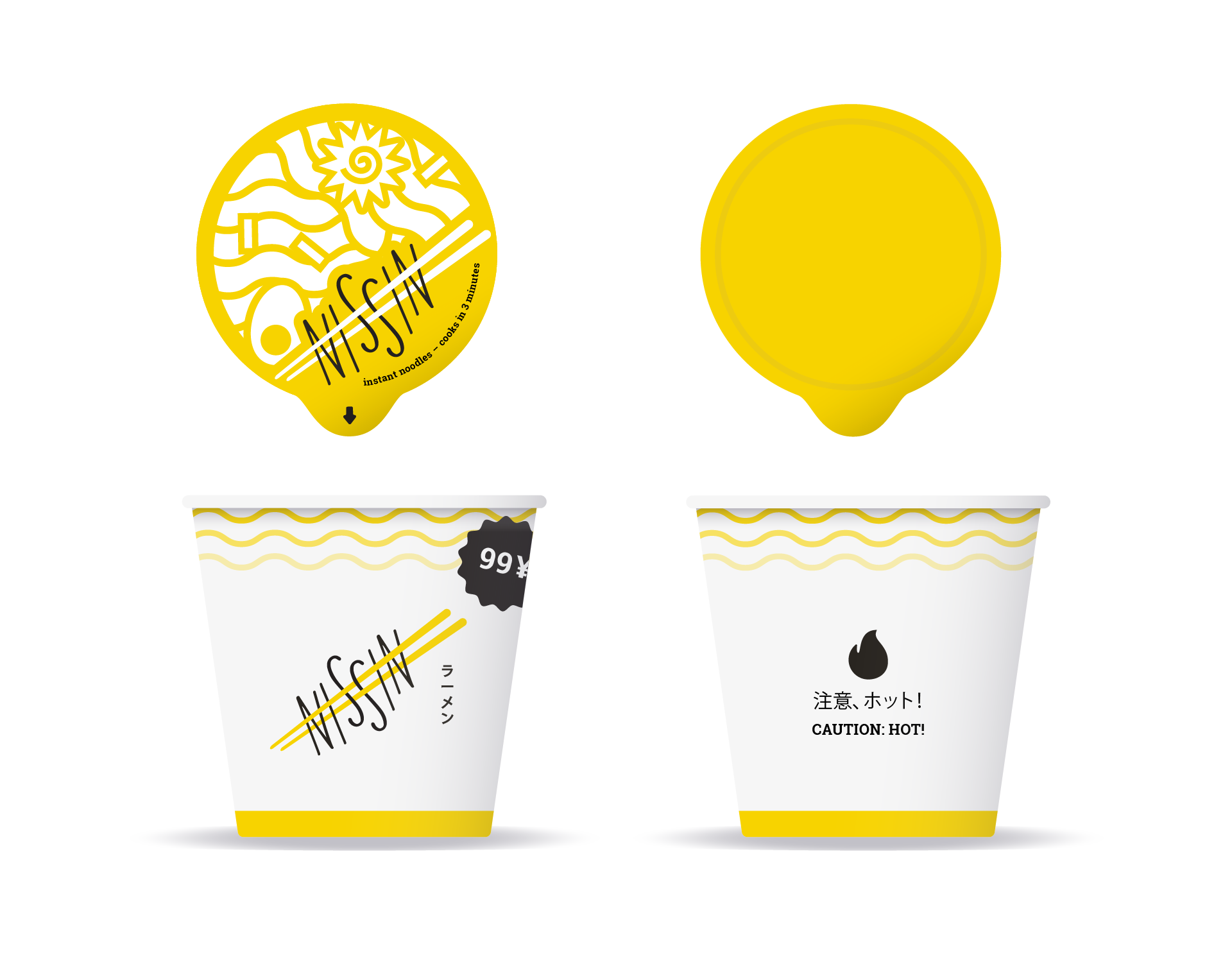
My goal with this redesign was to have fun. After that, it was to push the brand as crisp, clean and modern as I could – without sacrificing the fun and whimsy of the brand.
LOGO
Crafted,
not typed.
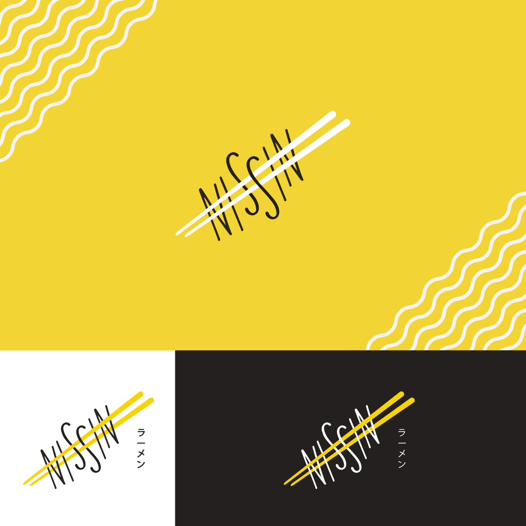
A bit less focus on the bowl, and more on the iconic shelf-stable noodles. Introducing a hand-drawn font to tie in with the illustrated elements across the branding.
ADVERTISING
It’s New York, baby.
When Nissin inevitably hits me up to make this a reality, we’ll strike a brand deal with Ichiran in New York, New York. A month long takeover will allow customers to try Nissin’s high-quality noodles and base paired with Ichirans toppings.
FONTS
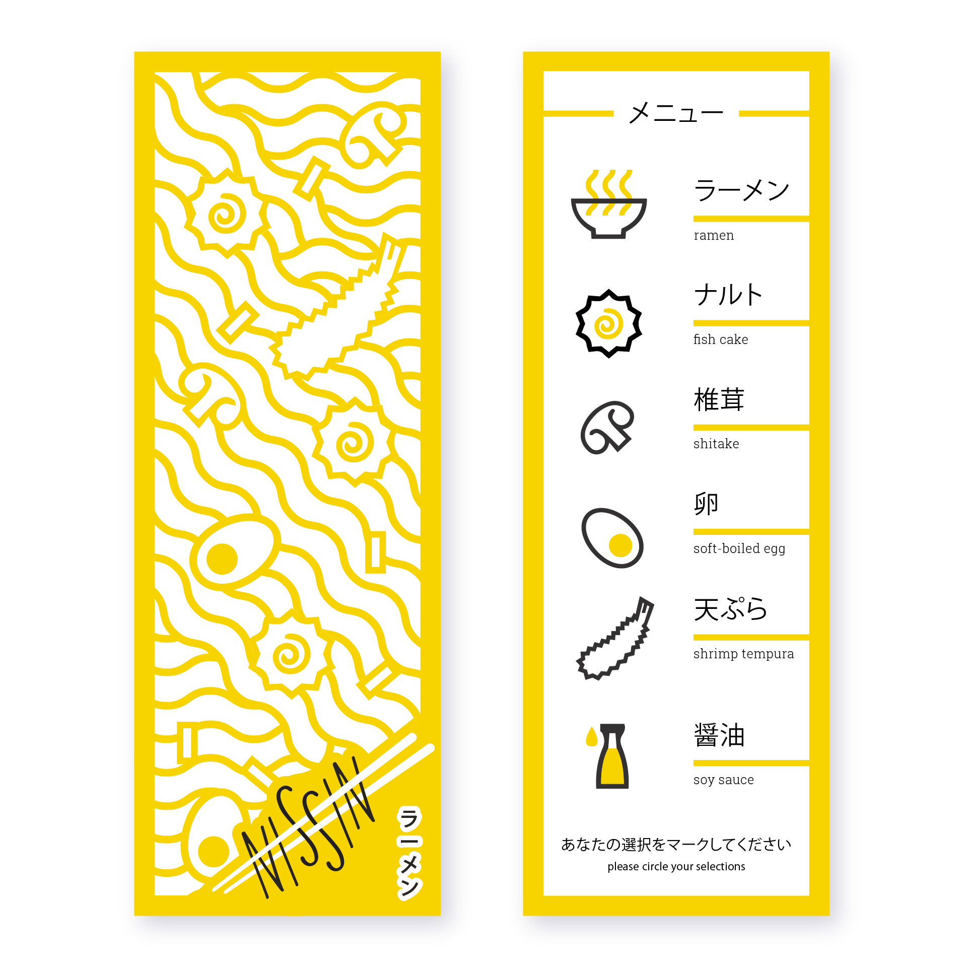
Nissin is beloved by Japanese and American consumers alike, and so it was important to find a font that looked great in both languages. This approach will help facillitate the Ichiran pop-up, as Ichirans signage is primarily in Japanese.